MindBalance Development Process
Design decisions, branding exploration, before & after comparisons, and feature justification
Green reads as "nature" and "health" but felt clinical and shared with medical/pharmacy branding. The darker shades lacked warmth for a supportive mental health site.
Blue conveys trust and calm but felt too corporate. Many large mental health organizations already use blue (BetterHelp, Calm), so we wanted to stand out with something more personal.
Pure yellows felt energetic but not grounded. Bright yellow in particular had accessibility issues (low contrast on white). The amber tones were closer to what we wanted but still felt too saturated.
We landed on warm gold as our primary color. It is distinct from every major mental health platform, conveys warmth and trust rather than just clinical calm, and pairs naturally with cream and off-white backgrounds. The deep navy for text gives strong contrast without the coldness of pure black.
These wireframes represent the structural decisions made before any colors or fonts were chosen. We focused on information hierarchy: what does a user see first, what action do we want them to take, and how do they navigate from crisis support to educational content.
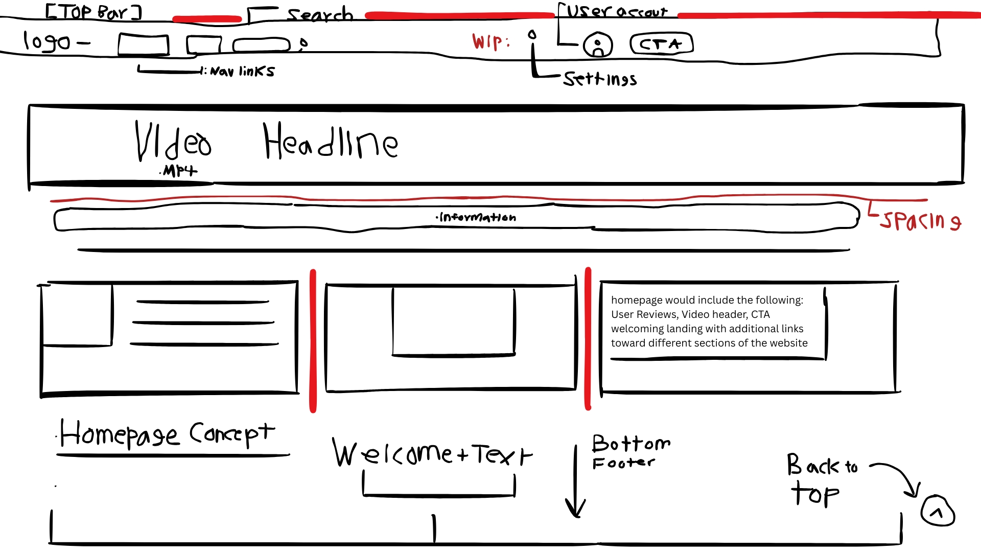
Key decision: hero video above the fold with a single clear CTA, then topic cards driving to articles.
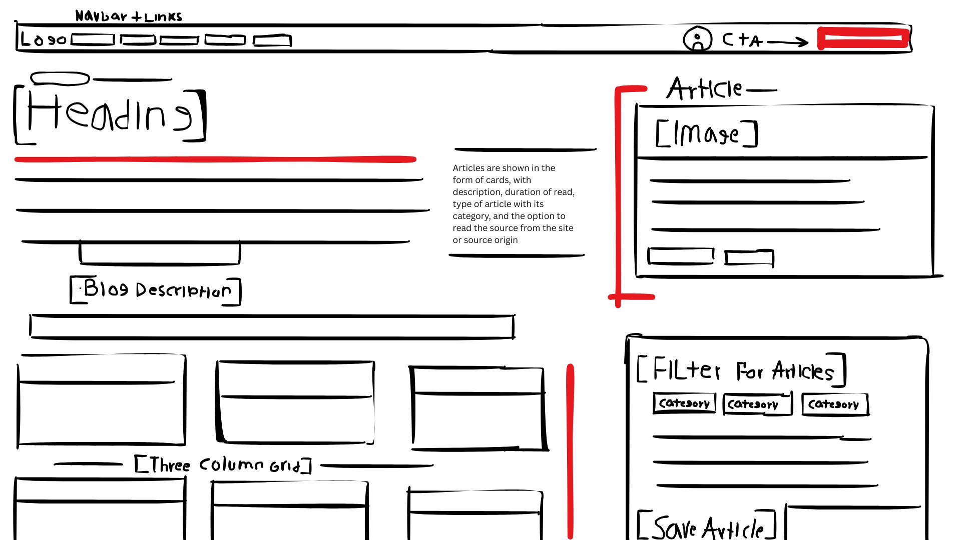
Key decision: filter chips across the top so users can find topics instantly; featured article gets a wide card.
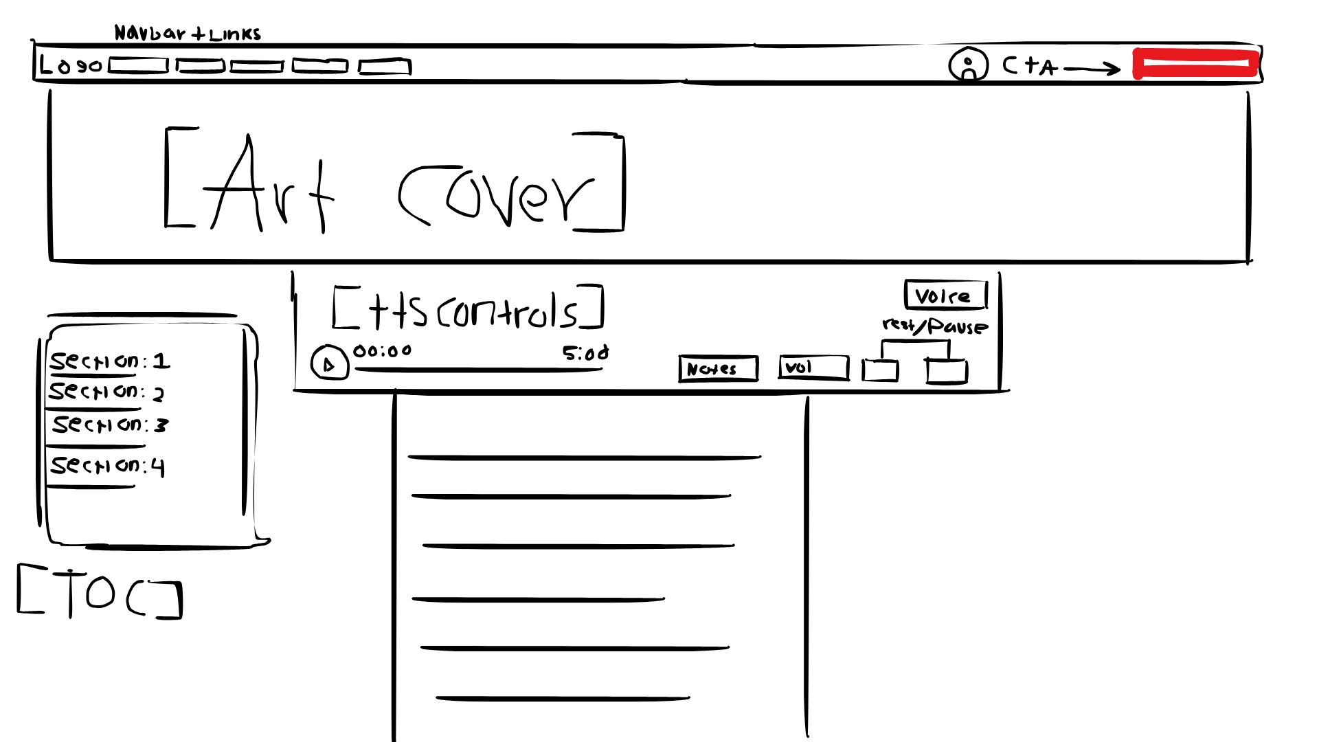
Key decision: breadcrumb at top, TTS player controls near the article hero, social share buttons at the bottom.
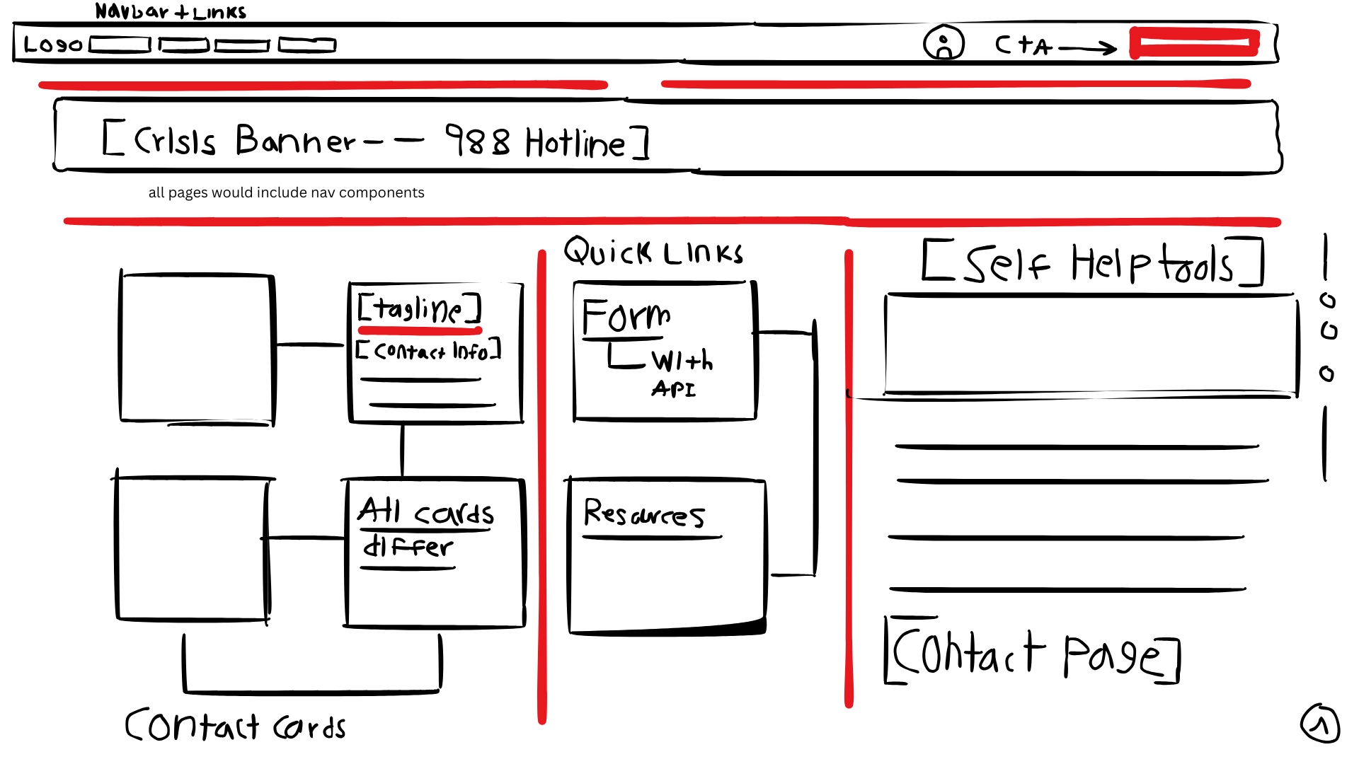
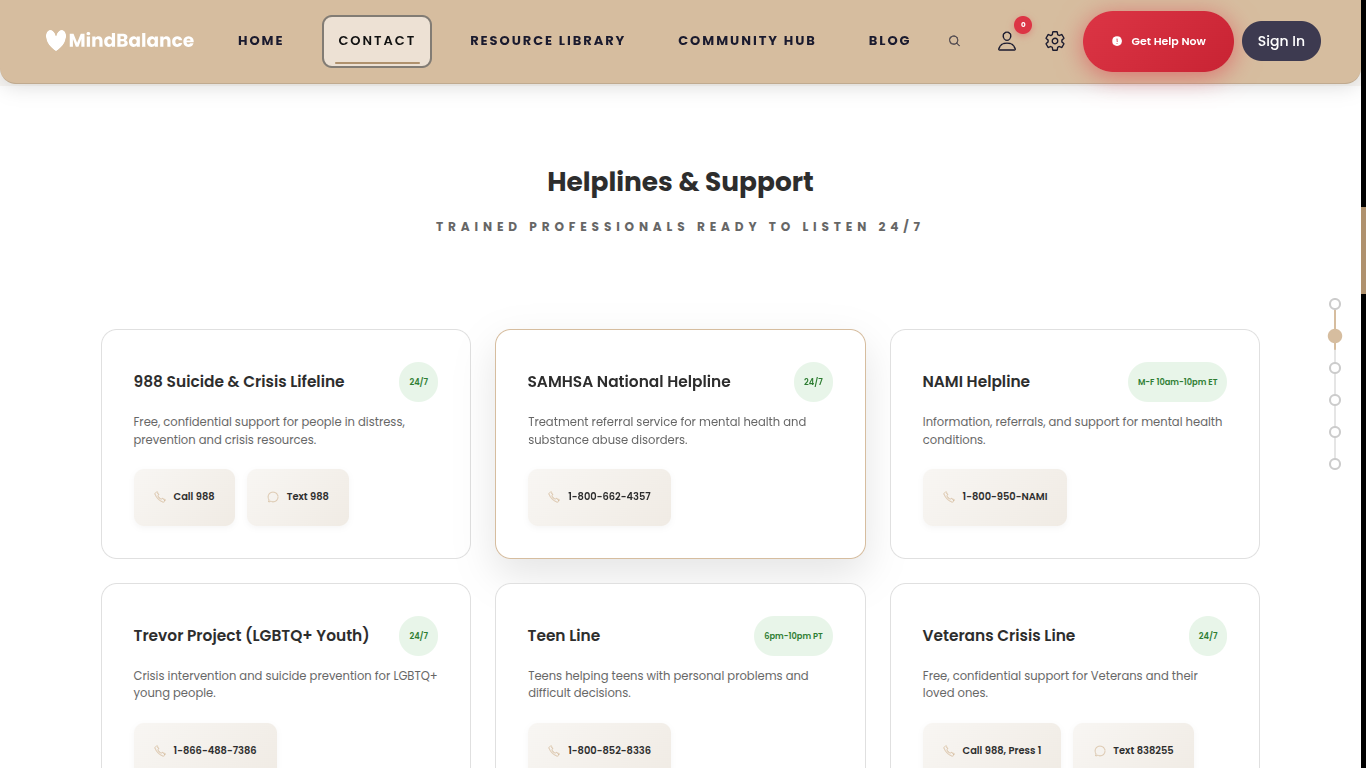
Key decision: crisis 988 number positioned at the very top so it is the first thing someone in distress sees.
The following comparisons show how each major section evolved from its first working version to the final design submitted for competition.
Early build: Basic white cards with green 24/7 badges. The header used an early gold-brown navbar tone. Cards had no hover animation. The page had a floating scroll-progress indicator on the right side that was later removed.
- Crisis 988 banner pinned to the top of the page
- Cards reorganized by urgency: 24/7 lines listed first
- Hover lift animation and gold accent border added to cards
- Call / Text buttons replaced with cleaner icon-labeled buttons
- Page uses breadcrumb navigation to help users retrace their path
- Fully translated into 11 languages via the translation engine
- Dark mode support added to all card and banner elements
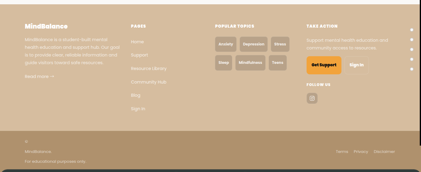
Early footer: The MindBalance logo was plain text. A large orange "Get Support" button felt visually mismatched. The footer background was a flat tan tone. Topic tags were not linked.
- Logo replaced with the full SVG heart + wordmark
- Footer background darkened for proper contrast with white text
- Topic tags now link to the filtered blog page
- "Get Support" button color unified to brand gold
- Added newsletter sign-up field with email validation
- Social icons expanded (Instagram, future channels)
- Copyright year and legal links reformatted for readability
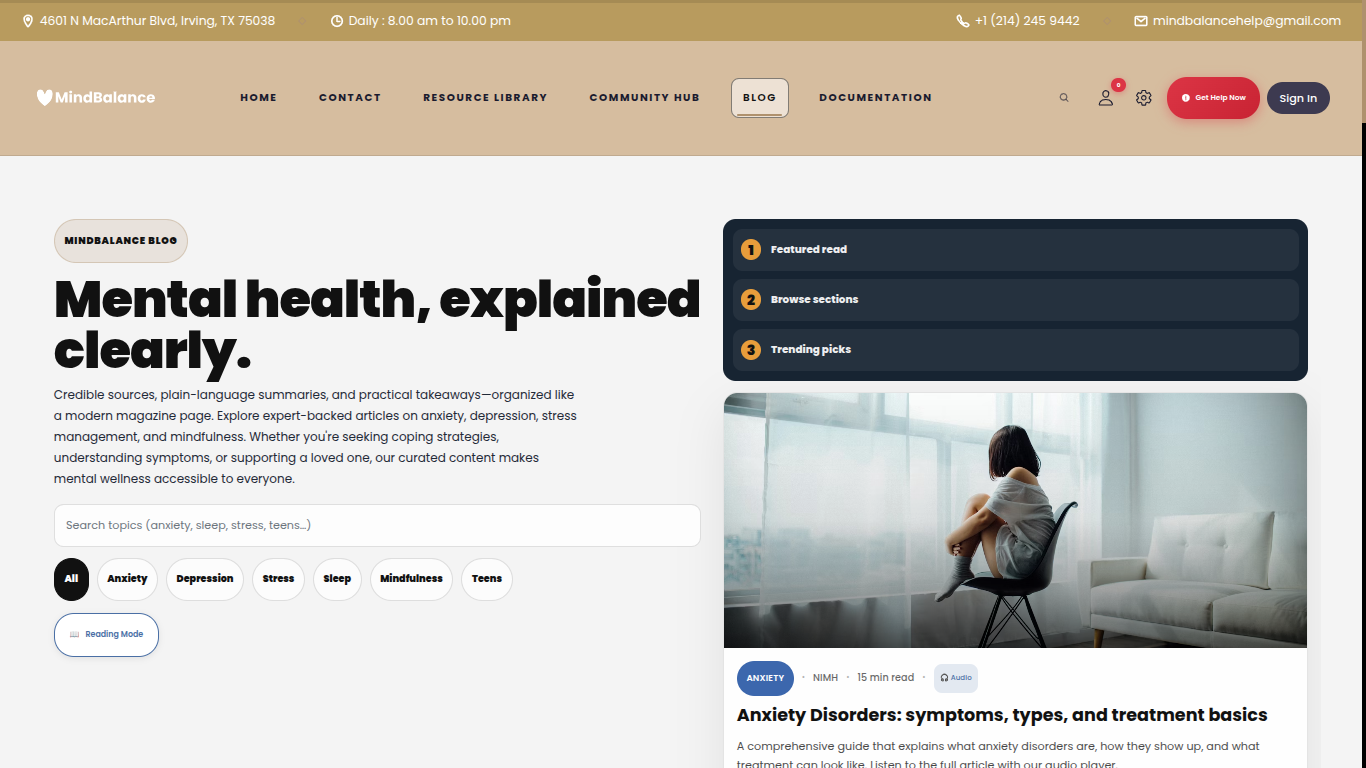
Early blog: A dark navy hero section dominated the page. A numbered sidebar (Featured read, Browse sections, Trending picks) was a layout experiment that was later dropped. The topbar showed a physical address and phone number in its early form.
- Dark hero removed; blog header now uses the cream brand background
- Sidebar table-of-contents replaced with filter chip system
- Search bar added with live topic filtering
- Reading Mode toggle added for distraction-free browsing
- Article cards show read time, category badge, and audio icon
- Articles organized into 6 topic categories with count badges
- Fully responsive on mobile with stacked card layout
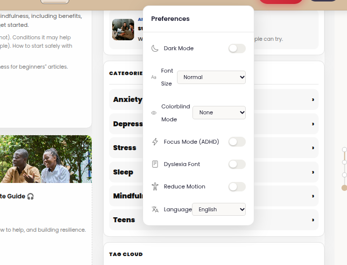
Early settings: Preferences appeared as a simple floating panel with minimal styling. The panel had no animation, no keyboard shortcut access, and was triggered only from the gear icon in the navbar.
- Redesigned as a full slide-in modal with organized sections
- Keyboard shortcut system: Alt+Shift keys for every setting
- Accent color picker added (6 brand-approved color themes)
- Line height and font size controls expanded
- High contrast mode and focus mode added
- Settings persist across every page via localStorage
- Animated open/close with reduced-motion support
Each feature below was identified through research into what users visiting a mental health website actually need, then designed and coded from scratch by our team. No templates or AI-generated code were used.
- We chose which crisis keywords to detect and wrote that list ourselves
- We designed the quick-chip buttons (I'm feeling anxious, Help me calm down) based on what we thought users would struggle to type
- We wrote the system prompt that shapes the companion's tone and focus on mental health only
- We set a 2000-character message limit to prevent misuse
- We chose a 10-point scale after testing 5-point and emoji-based scales with classmates
- We decided to store an optional text note alongside each log entry
- We wrote the SQL schema for the mood_logs table in Supabase ourselves
- We added AI-powered insights that summarize mood patterns weekly using the OpenAI API
- We chose to pre-cache audio server-side rather than generate it per request, for faster load times
- We selected the ElevenLabs voice after listening to multiple options and choosing the clearest one
- We designed the compact player bar so it does not take up article reading space
- We wrote the browser TTS fallback ourselves in JavaScript
- We chose the 11 languages based on which are most spoken in the Irving, TX school district
- We built the translation system ourselves rather than using a third-party i18n library
- We decided to use data-translate attributes so the system works without modifying HTML content
- We added RTL support for Arabic so the page layout flips correctly
- We designed all 15 badge names and descriptions ourselves
- We chose which behaviors to reward (reading, mood logging, community posts)
- We built the gold trophy toast pop-up animation for badge awards
- We reduced the notification poll interval to 30 seconds for near-real-time feel
- We chose to support Protanopia, Deuteranopia, and Tritanopia colorblind modes with SVG filters we wrote ourselves
- We decided ADHD mode should reduce sidebar distractions and highlight the main content
- We added the dyslexia-friendly OpenDyslexic font option after reading about its benefits
- We implemented 7 keyboard shortcuts (Alt+Shift+S/D/H/F/M/A/Y) for power users